ToolBar Tutorial With Example In Android Studio
In Android Toolbar is similar to an ActionBar(now called as App Bars). Toolbar is a Viewgroup that can be placed at anywhere in the Layout. We can easily replace an ActionBar with Toolbar.
Toolbar was introduced in Material Design in API level 21 (Android 5.0 i.e Lollipop). Material Design brings lot of new features in Android that changed a lot the visual design patterns regarding the designing of modern Android applications.
An Action bar is traditionally a part of an Activity opaque window decor controlled by the framework but a Toolbar may be placed at any level of nesting within a view hierarchy. Toolbar provides more feature than ActionBar. A Toolbar may contain a combination of elements from start to end.
Important Note: Toolbar’s are more flexible than ActionBar. We can easily modify its color, size and position. We can also add labels, logos, navigation icons and other views in it. In Material Design Android has updated the AppCompat support libraries so that we can use Toolbar’s in our devices running API Level 7 and up. In AppCompat, Toolbar is implemented in the android.support.v7.widget.Toolbar class.
Table Of Contents
Define Design Support Library:
To use Toolbar you need to add design support library in build.gradle file.
Gradle Scripts > build.gradle (Module:App) -> inside dependencies
compile 'com.android.support:design:24.1.1' // design support Library
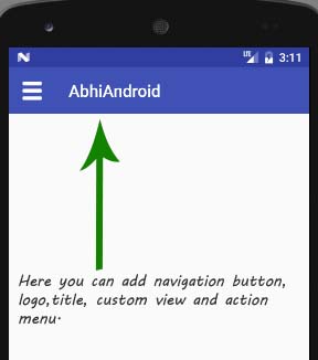
Elements of Toolbar In Android:
In Android Toolbar has more features than ActionBar and we can easily replace a ActionBar with Toolbar. In Toolbar from start to end it may contain a combination of Elements. Below we describe each and every element of Toolbar.
 Navigation Button: It may be a Navigation menu toggle, up arrow, close, done, collapse or any other glyph of the app’s choosing.
- Brand Logo Image: It may extend to the height of the toolbar and can be arbitrarily wide.
- Title and SubTitle: A title should be a signpost for the current position of Toolbar’s navigation hierarchy and the content contained there. Subtitle represents any extended information about the current content. If an app uses a logo then it should strongly consider omitting a title and subtitle.
- One or More Custom Views: An Application may add arbitrary child views to the Toolbar. If child view’s Toolbar.LayoutParams indicates CENTER_HORIZONTAL Gravity then view will attempt to center within the available space remaining in the Toolbar after all other element’s have been measured.
- Action Menu: The menu of Actions will pin to the end of the Toolbar offering a few important, typical or frequent actions along with an optional overflow menu for additional actions. Action buttons are aligned vertically within the Toolbar’s minimum height if we set.
Basic Toolbar XML code:
<?xml version="1.0" encoding="utf-8"?>
<android.support.v7.widget.Toolbar xmlns:android="http://schemas.android.com/apk/res/android"
    android:layout_width="match_parent"
    android:layout_height="wrap_content"
    android:background="@color/colorPrimary"
    android:theme="@style/ThemeOverlay.AppCompat.Dark">

</android.support.v7.widget.Toolbar>
Setting Toolbar as An ActionBar:
We can easily replace ActionBar with Toolbar by using setSupportActionBar() method. Here is the code of replacing ActionBar with Toolbar.
 Toolbar toolbar = (Toolbar) findViewById(R.id.toolbar); // get the reference of Toolbar
setSupportActionBar(toolbar); // Setting/replace toolbar as the ActionBar
Attributes of Toolbar In Android:
Now let’s we discuss some common attributes of a Toolbar that helps us to configure it in our layout (xml).
- id: This attribute is used to set the id for the Toolbar. Id is used to uniquely identify a Toolbar.
Below we set the id of the Toolbar.<?xml version="1.0" encoding="utf-8"?> <android.support.v7.widget.Toolbar xmlns:android="http://schemas.android.com/apk/res/android" android:layout_width="match_parent" android:layout_height="wrap_content" android:id="@+id/toolbar" android:background="@color/colorPrimary" android:theme="@style/ThemeOverlay.AppCompat.Dark"> </android.support.v7.widget.Toolbar> - logo: This attribute is used to set as the drawable logo that appears at the starting side of the Toolbar means just after the navigation button. We can also do this programmatically by using setLogo() method.Below we set the logo for the Toolbar.
<?xml version="1.0" encoding="utf-8"?>
<android.support.v7.widget.Toolbar xmlns:android="http://schemas.android.com/apk/res/android"
    xmlns:app="http://schemas.android.com/apk/res-auto"
    android:id="@+id/toolbar"
    android:layout_width="match_parent"
    android:layout_height="wrap_content"
    android:background="@color/colorPrimary"
    android:theme="@style/ThemeOverlay.AppCompat.Dark"
    app:logo="@drawable/logo"><!-- logo for the Toolbar-->
</android.support.v7.widget.Toolbar>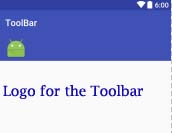
- logoDescription: This attribute is used to set the content description string to describe the appearance of the associated logo image. We can also do this programmatically by using setLogoDescription() method.
Below we set the description for the displayed logo.<?xml version="1.0" encoding="utf-8"?> <android.support.v7.widget.Toolbar xmlns:android="http://schemas.android.com/apk/res/android" xmlns:app="http://schemas.android.com/apk/res-auto" android:id="@+id/toolbar" android:layout_width="match_parent" android:layout_height="wrap_content" android:background="@color/colorPrimary" android:theme="@style/ThemeOverlay.AppCompat.Dark" app:logo="@drawable/logo" app:logoDescription="LOGO"><!-- logo and logo description for the Toolbar--> </android.support.v7.widget.Toolbar> - navigationIcon: This attribute is used to set the Icon drawable for the navigation button that located at the start of the toolbar. We can also do this programmatically by using setNavigationIcon() method.Below we set the icon for the navigation button.
<?xml version="1.0" encoding="utf-8"?>
<android.support.v7.widget.Toolbar xmlns:android="http://schemas.android.com/apk/res/android"
    xmlns:app="http://schemas.android.com/apk/res-auto"
    android:id="@+id/toolbar"
    android:layout_width="match_parent"
    android:layout_height="wrap_content"
    android:background="@color/colorPrimary"
    android:theme="@style/ThemeOverlay.AppCompat.Dark"
    app:navigationIcon="@drawable/logo"><!-- navigation icon for the Toolbar-->
</android.support.v7.widget.Toolbar>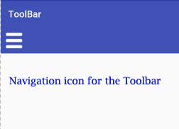
- navigationContentDescription: This attribute is used to set the text for the description of navigation button. We can also do this programmatically by using setNavigationContentDescription() method.
Below we set the content description for the displayed icon of navigation button.<?xml version="1.0" encoding="utf-8"?> <android.support.v7.widget.Toolbar xmlns:android="http://schemas.android.com/apk/res/android" xmlns:app="http://schemas.android.com/apk/res-auto" android:id="@+id/toolbar" android:layout_width="match_parent" android:layout_height="wrap_content" android:background="@color/colorPrimary" android:theme="@style/ThemeOverlay.AppCompat.Dark" app:navigationContentDescription="Navigation Description" app:navigationIcon="@drawable/logo"> <!-- navigation icon and description for the Toolbar--> </android.support.v7.widget.Toolbar> - title: This attribute is used to set title for the Toolbar. We can also do this programmatically by using setTitle() method.
Below we set the title for the Toolbar.<?xml version="1.0" encoding="utf-8"?> <android.support.v7.widget.Toolbar xmlns:android="http://schemas.android.com/apk/res/android" xmlns:app="http://schemas.android.com/apk/res-auto" android:id="@+id/toolbar" android:layout_width="match_parent" android:layout_height="wrap_content" android:background="@color/colorPrimary" android:theme="@style/ThemeOverlay.AppCompat.Dark" app:title="AbhiAndroid"> <!-- title for the Toolbar--> </android.support.v7.widget.Toolbar>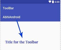
- titleTextColor: This attribute is used to set the color for the title text. We can also do this programmatically by using setTitleTextColor() method.Below we set the red color for the dispalyed title text.
<?xml version="1.0" encoding="utf-8"?>
<android.support.v7.widget.Toolbar xmlns:android="http://schemas.android.com/apk/res/android"
    xmlns:app="http://schemas.android.com/apk/res-auto"
    android:id="@+id/toolbar"
    android:layout_width="match_parent"
    android:layout_height="wrap_content"
    android:background="@color/colorPrimary"
    android:theme="@style/ThemeOverlay.AppCompat.Dark"
    app:titleTextColor="#F00"
    app:title="AbhiAndroid">
    <!-- title text color for the Toolbar-->
</android.support.v7.widget.Toolbar>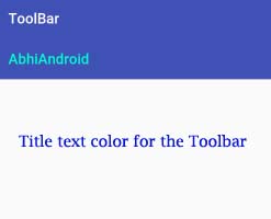
- subtitle: This attribute is used to set the sub title for the Toolbar. We can also do this programmatically by using setSubtitle() method.
Below we set the sub title for the Toolbar.<?xml version="1.0" encoding="utf-8"?> <android.support.v7.widget.Toolbar xmlns:android="http://schemas.android.com/apk/res/android" xmlns:app="http://schemas.android.com/apk/res-auto" android:id="@+id/toolbar" android:layout_width="match_parent" android:layout_height="wrap_content" android:background="@color/colorPrimary" android:theme="@style/ThemeOverlay.AppCompat.Dark" app:subtitle="AbhiAndroid"> <!-- sub title for the Toolbar--> </android.support.v7.widget.Toolbar> - subtitleTextColor: This method is used to set the color for the sub title. We can also do this programmatically by using setSubtitleTextColor() method. Below we set the red color for displayed subtitle text.
<?xml version="1.0" encoding="utf-8"?>
<android.support.v7.widget.Toolbar xmlns:android="http://schemas.android.com/apk/res/android"
    xmlns:app="http://schemas.android.com/apk/res-auto"
    android:id="@+id/toolbar"
    android:layout_width="match_parent"
    android:layout_height="wrap_content"
    android:background="@color/colorPrimary"
    android:theme="@style/ThemeOverlay.AppCompat.Dark"
    app:subtitle="AbhiAndroid"
    app:subtitleTextColor="#F00">
    <!-- sub title text  color for the Toolbar-->
</android.support.v7.widget.Toolbar>
Important Methods of Toolbar:
Let’s we discuss some important methods of Toolbar that may be called in order to add Action icons manage the Toolbar.
Important Note: To understand below functions of Toolbar properly please do read 2nd example in this article.
- setLogo(int resId): This method is used to add a logo drawable from a resource id. Below we set a logo drawable in our Toolbar.
Toolbar toolbar = (Toolbar) findViewById(R.id.toolbar); // get the reference of Toolbar
setSupportActionBar(toolbar); // Setting/replace toolbar as the ActionBar
getSupportActionBar().setDisplayShowTitleEnabled(false); // hide the current title from the Toolbar
toolbar.setLogo(R.drawable.logo); // setting a logo in toolbar
- setLogo(Drawable drawable): This method is also used to add a logo drawable in our Toolbar. In this method we set a drawable object. Below we set a drawable logo in our Toolbar.
Toolbar toolbar = (Toolbar) findViewById(R.id.toolbar); // get the reference of Toolbar
setSupportActionBar(toolbar); // Setting/replace toolbar as the ActionBar
getSupportActionBar().setDisplayShowTitleEnabled(false); // hide the current title from the Toolbar
toolbar.setLogo(getResources().getDrawable(R.drawable.logo)); // setting a logo in toolbar
- getLogo(): This method is used to get the logo icon from Toolbar. This method returns the Drawable logo which we set using setLogo() method.
Below we firstly set the drawable logo and then get the same from Toolbar.Toolbar toolbar = (Toolbar) findViewById(R.id.toolbar); // get the reference of Toolbar setSupportActionBar(toolbar); // Setting/replace toolbar as the ActionBar toolbar.setLogo(getResources().getDrawable(R.drawable.logo)); // setting a logo in toolbar Drawable drawableLogo=toolbar.getLogo(); // get the drawable logo from Toolbar getSupportActionBar().setDisplayShowTitleEnabled(false); // hide the current title from the Toolbar
- setLogoDescription(CharSequence description): This method is used to set a description for the drawable logo of Toolbar.
Below we set the description for Toolbar’s logo.Toolbar toolbar = (Toolbar) findViewById(R.id.toolbar); // get the reference of Toolbar setSupportActionBar(toolbar); // Setting/replace toolbar as the ActionBar toolbar.setLogo(getResources().getDrawable(R.drawable.logo)); // setting a logo in toolbar toolbar.setLogoDescription("LOGO"); // set description for the logo getSupportActionBar().setDisplayShowTitleEnabled(false); // hide the current title from the Toolbar - setLogoDescription(int resId): This method is also used to set the description for drawable logo of the Toolbar. This method set the description from string file.
Below we set the description for Toolbar’s logo.Toolbar toolbar = (Toolbar) findViewById(R.id.toolbar); // get the reference of Toolbar setSupportActionBar(toolbar); // Setting/replace toolbar as the ActionBar toolbar.setLogo(getResources().getDrawable(R.drawable.logo)); // setting a logo in toolbar toolbar.setLogoDescription(getResources().getString(R.string.descrition)); // set description for the logo getSupportActionBar().setDisplayShowTitleEnabled(false); // hide the current title from the Toolbar
- getLogoDescription(): This method is used to get the description of toolbar’s logo. This method returns description in CharSequence object. Below we firstly set the description for logo of Toolbar and then get the same from Toolbar.
Toolbar toolbar = (Toolbar) findViewById(R.id.toolbar); // get the reference of Toolbar setSupportActionBar(toolbar); // Setting/replace toolbar as the ActionBar toolbar.setLogo(getResources().getDrawable(R.drawable.logo)); // setting a logo in Toolbar toolbar.setLogoDescription("LOGO"); // set description for the logo CharSequence logoDescription=toolbar.getLogoDescription(); // get the logo description from Toolbar getSupportActionBar().setDisplayShowTitleEnabled(false); // hide the current title from the Toolbar - setNavigationIcon(int resId): This method is used to set the icon from resource id to the Toolbar’s navigation button.
Below we set a navigation icon in the Toolbar from resource id.Toolbar toolbar = (Toolbar) findViewById(R.id.toolbar); // get the reference of Toolbar setSupportActionBar(toolbar); // Setting/replace toolbar as the ActionBar toolbar.setNavigationIcon(R.mipmap.ic_launcher); // set icon for navigation button getSupportActionBar().setDisplayShowTitleEnabled(false); // hide the current title from the Toolbar
- setNavigationIcon(Drawable icon): This method is also used to set the icon for Navigation Buttton. In this method we set the icon from drawable object.Below we set drawable icon for Navigation Button.
Toolbar toolbar = (Toolbar) findViewById(R.id.toolbar); // get the reference of Toolbar
setSupportActionBar(toolbar); // Setting/replace toolbar as the ActionBar
toolbar.setNavigationIcon(getResources().getDrawable(R.drawable.logo)); // setting a navigation icon in Toolbar
getSupportActionBar().setDisplayShowTitleEnabled(false); // hide the current title from the Toolbar
- getNavigationIcon(): This method is used to get the navigation icon from Toolbar which we set using setNavigationIcon() method. This method returns a drawable object. Below we firstly set the navigation icon and then get the same from Toolbar.
Toolbar toolbar = (Toolbar) findViewById(R.id.toolbar); // get the reference of Toolbar
setSupportActionBar(toolbar); // Setting/replace toolbar as the ActionBar
toolbar.setNavigationIcon(getResources().getDrawable(R.drawable.logo)); // setting a navigation icon in Toolbar
Drawable navigationIcon = toolbar.getNavigationIcon(); // get navigation icon from Toolbar
getSupportActionBar().setDisplayShowTitleEnabled(false); // hide the current title from the Toolbar
- setTitle(int resId): This method is used to set the Title for the Toolbar. In this method we set the title form string file.
Below we set the title for the Toolbar.Toolbar toolbar = (Toolbar) findViewById(R.id.toolbar); // get the reference of Toolbar setSupportActionBar(toolbar); // Setting/replace toolbar as the ActionBar4 toolbar.setTitle(getResources().getString(R.string.title)); // setting a title for this Toolbar
- setTitle(CharSequence title): This method is also used to set the title for the Toolbar.
Below we set the title for the Toolbar.Toolbar toolbar = (Toolbar) findViewById(R.id.toolbar); // get the reference of Toolbar setSupportActionBar(toolbar); // Setting/replace toolbar as the ActionBar4 toolbar.setTitle("AbhiAndroid"); // setting a title for this Toolbar - setSubtitle(int resId): This method is used to set the sub Title for the Toolbar. In this method we set the sub title form string file.
Below we set the sub title for the Toolbar.Toolbar toolbar = (Toolbar) findViewById(R.id.toolbar); // get the reference of Toolbar setSupportActionBar(toolbar); // Setting/replace toolbar as the ActionBar4 toolbar.setSubtitle(getResources().getString(R.string.subTitle)); // setting a sub title for this Toolbar getSupportActionBar().setDisplayShowTitleEnabled(false); // hide the current title from the Toolbar
- setSubtitle(CharSequence subtitle): This method is also used to set the sub title for the Toolbar.
Below we set the sub title for the Toolbar.Toolbar toolbar = (Toolbar) findViewById(R.id.toolbar); // get the reference of Toolbar setSupportActionBar(toolbar); // Setting/replace toolbar as the ActionBar4 toolbar.setSubtitle("AbhiAndroid"); // setting a sub title for this Toolbar getSupportActionBar().setDisplayShowTitleEnabled(false); // hide the current title from the Toolbar - getTitle(): This method is used to get the title of the Toolbar. This method returns CharSequence object for the title displayed on Toolbar.Below we firstly set the title and then get the same from Toolbar.
Toolbar toolbar = (Toolbar) findViewById(R.id.toolbar); // get the reference of Toolbar setSupportActionBar(toolbar); // Setting/replace toolbar as the ActionBar4 toolbar.setTitle("AbhiAndroid"); // setting a title for this Toolbar CharSequence title=toolbar.getTitle(); // get the displayed title from Toolbar. - getSubtitle(): This method is used to get the sub title of the Toolbar. This method returns CharSequence object for the sub title displayed on Toolbar.Below we firstly set the sub title and then get the same from Toolbar.
Toolbar toolbar = (Toolbar) findViewById(R.id.toolbar); // get the reference of Toolbar setSupportActionBar(toolbar); // Setting/replace toolbar as the ActionBar4 toolbar.setSubtitle("AbhiAndroid"); // setting a sub title for this Toolbar CharSequence title=toolbar.getSubtitle(); // get the displayed sub title from Toolbar. getSupportActionBar().setDisplayShowTitleEnabled(false); // hide the current title from the Toolbar - setNavigationContentDescription(CharSequence description): This method is used to set the description for the Navigation Button.
Below we set the description for Navigation Button.Toolbar toolbar = (Toolbar) findViewById(R.id.toolbar); // get the reference of Toolbar setSupportActionBar(toolbar); // Setting/replace toolbar as the ActionBar getSupportActionBar().setDisplayShowTitleEnabled(false); // hide the current title from the Toolbar toolbar.setNavigationIcon(R.drawable.logo); // set icon for navigation button toolbar.setNavigationContentDescription("Navigation"); // setting description for navigation button - setNavigationContentDescription(int resId): This method is used to set the description for the Navigation Button. This method sets the description from string file.Below we set the description od the navigation button.
Toolbar toolbar = (Toolbar) findViewById(R.id.toolbar); // get the reference of Toolbar setSupportActionBar(toolbar); // Setting/replace toolbar as the ActionBar getSupportActionBar().setDisplayShowTitleEnabled(false); // hide the current title from the Toolbar toolbar.setNavigationIcon(R.drawable.logo); // set icon for navigation button toolbar.setNavigationContentDescription(getResources().getString(R.string.description)); // setting description for navigation button.
- getNavigationContentDescription(): This method is used to get the currently configured content description for the navigation button view. This method returns the description in CharSequence object which we set using setNavigationContentDescription() method.Below we firstly set the description of navigation button and then get the same from Toolbar.
Toolbar toolbar = (Toolbar) findViewById(R.id.toolbar); // get the reference of Toolbar setSupportActionBar(toolbar); // Setting/replace toolbar as the ActionBar getSupportActionBar().setDisplayShowTitleEnabled(false); // hide the current title from the Toolbar toolbar.setNavigationIcon(R.drawable.logo); // set icon for navigation button toolbar.setNavigationContentDescription("Navigation"); // setting description for navigation button CharSequence description=toolbar.getNavigationContentDescription(); // get navigation button description - setTitleTextColor(int color): This method is used to set the text color for the displayed title.
Below we set the red color for the displayed text of title.Toolbar toolbar = (Toolbar) findViewById(R.id.toolbar); // get the reference of Toolbar setSupportActionBar(toolbar); // Setting/replace toolbar as the ActionBar toolbar.setTitle("AbhiAndroid"); // setting a title for this Toolbar toolbar.setTitleTextColor(Color.RED); // set title text color for Toolbar. - setSubtitleTextColor(int color): This method is used to set the text color for the displayed sub title.
Below we set the red color for the displayed sub text of title.Toolbar toolbar = (Toolbar) findViewById(R.id.toolbar); // get the reference of Toolbar setSupportActionBar(toolbar); // Setting/replace toolbar as the ActionBar getSupportActionBar().setDisplayShowTitleEnabled(false); // hide the current title from the Toolbar toolbar.setSubtitle("AbhiAndroid"); // setting a sub title for this Toolbar toolbar.setSubtitleTextColor (Color.RED); // set sub title text color for Toolbar - setNavigationOnClickListener(View.OnClickListener listener): It sets a listener to respond to navigation events. This listener is used to handle the click event on navigation button. Below we implement setNavigationOnClickListener event on Toolbar that handles on click event of navigation button.
Toolbar toolbar = (Toolbar) findViewById(R.id.toolbar); // get the reference of Toolbar
setSupportActionBar(toolbar); // Setting/replace toolbar as the ActionBar
getSupportActionBar().setDisplayShowTitleEnabled(false); // hide the current title from the Toolbar
// implement setNavigationOnClickListener event
toolbar.setNavigationOnClickListener(new View.OnClickListener() {
@Override
public void onClick(View view) {
// add code here that execute on click of navigation button
}
});
Toolbar Example 1 In Android Studio:
Below is the first example of Toolbar in which we create a Toolbar and replace it with ActionBar. In this examle we add action icons in Toobar and on click of navigation Button of Toolbar we open a Navigation Drawer. In our main layout we use Drawer Layout and Navigation View. Drawer Layout is the root layout in which we include a Toolbar and also define a FrameLayout and a Navigation View. In Navigation View we set the items from menu file and FrameLayout is used to replace the Fragments on the click of menu items. Whenever a user click on menu item, Fragment is replaced according to menu item’s id and a toast message with menu item title is displayed on the screen. We also create three Fragments that should be replaced on click of menu items
Step 1: Create a new project and name it ToolbarExample.
Step 2: Open Gradle Scripts > build.gradle and add Design support library dependency. If you are on the latest version of Android Studio you don’t need to add a compiled dependency for Appcombat v7 21 library if not then please make sure you add the line below in your gradel build dependencies.
apply plugin: ‘com.android.application’
android {
compileSdkVersion 24
buildToolsVersion "24.0.1"
defaultConfig {
applicationId "abhiandroid.toolbarexample"
minSdkVersion 16
targetSdkVersion 24
versionCode 1
versionName "1.0"
}
buildTypes {
release {
minifyEnabled false
proguardFiles getDefaultProguardFile('proguard-android.txt'), 'proguard-rules.pro'
}
}
}
dependencies {
compile fileTree(dir: 'libs', include: ['*.jar'])
testCompile 'junit:junit:4.12'
compile 'com.android.support:appcompat-v7:24.1.1'
compile 'com.android.support:design:24.1.1' // design support Library
}
Step 3: ActionBars are replaced with Toolbar so we can still use ActionBar but in our example we are going to make a Toolbar so go to your style.xml file and change the theme to “Theme.AppCompat.Light.NoActionBar” This theme helps us get rid of the ActionBar so we can make a Toolbar.
    <!-- Base application theme. -->
    <style name="AppTheme" parent="Theme.AppCompat.Light.NoActionBar">
        <!-- Customize your theme here. -->
        <item name="colorPrimary">@color/colorPrimary</item>
        <item name="colorPrimaryDark">@color/colorPrimaryDark</item>
        <item name="colorAccent">@color/colorAccent</item>
    </style>
</resources>
Step 4: Now let’s talk about the color scheme for our application. Open your color.xml file from values folder. In this XML file colorPrimary is the primary color for the app and colorPrimaryDark color is the color of the status bar. We can easily change our colors from this file.
<?xml version="1.0" encoding="utf-8"?>
<resources>
    <color name="colorPrimary">#3F51B5</color>
    <color name="colorPrimaryDark">#303F9F</color>
    <color name="colorAccent">#FF4081</color>
</resources>
Step 5: Open res -> layout -> activity_main.xml (or) main.xml and add following code:
In this step we define a DrawerLayout that is the parent layout in which we include a toolbar.xml file and also define a FrameLayout and a Navigation View. In Navigation View we set the items from menu file named “nav_items” and FrameLayout is used to replace the Fragments on the click of menu items.
<?xml version="1.0" encoding="utf-8"?>
<android.support.v4.widget.DrawerLayout xmlns:android="http://schemas.android.com/apk/res/android"
    xmlns:app="http://schemas.android.com/apk/res-auto"
    xmlns:tools="http://schemas.android.com/tools"
    android:id="@+id/drawer_layout"
    android:layout_width="match_parent"
    android:layout_height="match_parent"
    android:fitsSystemWindows="true"
    tools:context=".MainActivity">
    <LinearLayout
        android:layout_width="match_parent"
        android:layout_height="match_parent"
        android:orientation="vertical">
        <!-- include your toolbar layout-->
        <include layout="@layout/toolbar" />
        <!-- Let's add fragment -->
        <FrameLayout
            android:id="@+id/frame"
            android:layout_width="match_parent"
            android:layout_height="match_parent" />
    </LinearLayout>
    <!--
         Navigation view to show the menu items
    -->
    <android.support.design.widget.NavigationView
        android:id="@+id/navigation"
        android:layout_width="wrap_content"
        android:layout_height="match_parent"
        android:layout_gravity="start"
        app:menu="@menu/nav_items" />
</android.support.v4.widget.DrawerLayout>
Step 6: Open res -> menu -> nav_items.xml and add following code. Here we define the menu items.
<?xml version="1.0" encoding="utf-8"?>
<menu xmlns:android="http://schemas.android.com/apk/res/android">
    <group android:checkableBehavior="single">
        <!--
                Add menu items here
                Menu items with icon and Title
        -->
        <item
            android:id="@+id/first"
            android:icon="@mipmap/ic_launcher"
            android:title="First Menu" />
        <item
            android:id="@+id/second"
            android:icon="@mipmap/ic_launcher"
            android:title="Second Menu" />
        <item
            android:id="@+id/third"
            android:icon="@mipmap/ic_launcher"
            android:title="Third Menu" />
    </group>
</menu>
Step 7: Now create a xml layouts by right clicking on res/layout -> New -> Layout Resource File and name it toolbar.xml
In this file we set the background color, navigation button and tilte for the Toolbar.
<?xml version="1.0" encoding="utf-8"?>
<android.support.v7.widget.Toolbar xmlns:android="http://schemas.android.com/apk/res/android"
    xmlns:app="http://schemas.android.com/apk/res-auto"
    android:id="@+id/toolbar"
    android:layout_width="match_parent"
    android:layout_height="wrap_content"
    android:background="@color/colorPrimary"
    android:theme="@style/ThemeOverlay.AppCompat.Dark"
    app:navigationIcon="@drawable/menu_icon"
    app:title="AbhiAndroid"
    app:titleTextColor="#FFF">
    <!-- navigation button and title for the Toolbar-->
</android.support.v7.widget.Toolbar>
Step 8: Open src -> package -> MainActivity.java
In this step we open the MainActivity and add the code for initiates the views(DrawerLayout, Toolbar,NavigationView and other views). In this we replace the ActionBar with our ToolBar by using setSupportActionBar() method and then implment setNavigationOnClickListener event and add the code to open the drawer on click of navigation button. After that we implement setNavigationItemSelectedListener event on NavigationView so that we can replace the Fragments according to menu item’s id and a toast message with menu item’s title is displayed on the screen. In this I have added comments in code to help you to understand the code easily so make you read the comments.
package abhiandroid.toolbarexample;
import android.os.Bundle;
import android.support.design.widget.NavigationView;
import android.support.v4.app.Fragment;
import android.support.v4.app.FragmentTransaction;
import android.support.v4.widget.DrawerLayout;
import android.support.v7.app.AppCompatActivity;
import android.support.v7.widget.Toolbar;
import android.view.Gravity;
import android.view.MenuItem;
import android.view.View;
import android.widget.Toast;
public class MainActivity extends AppCompatActivity {
DrawerLayout dLayout;
@Override
protected void onCreate(Bundle savedInstanceState) {
super.onCreate(savedInstanceState);
setContentView(R.layout.activity_main);
Toolbar toolbar = (Toolbar) findViewById(R.id.toolbar); // get the reference of Toolbar
setSupportActionBar(toolbar); // Setting/replace toolbar as the ActionBar

// implement setNavigationOnClickListener event
toolbar.setNavigationOnClickListener(new View.OnClickListener() {
@Override
public void onClick(View view) {
dLayout.openDrawer(Gravity.LEFT);
}
});
setNavigationDrawer(); // call method
}
private void setNavigationDrawer() {
dLayout = (DrawerLayout) findViewById(R.id.drawer_layout); // initiate a DrawerLayout
NavigationView navView = (NavigationView) findViewById(R.id.navigation); // initiate a Navigation View
// implement setNavigationItemSelectedListener event on NavigationView
navView.setNavigationItemSelectedListener(new NavigationView.OnNavigationItemSelectedListener() {
@Override
public boolean onNavigationItemSelected(MenuItem menuItem) {
Fragment frag = null; // create a Fragment Object
int itemId = menuItem.getItemId(); // get selected menu item's id
// check selected menu item's id and replace a Fragment Accordingly
if (itemId == R.id.first) {
frag = new FirstFragment();
} else if (itemId == R.id.second) {
frag = new SecondFragment();
} else if (itemId == R.id.third) {
frag = new ThirdFragment();
}
// display a toast message with menu item's title
Toast.makeText(getApplicationContext(), menuItem.getTitle(), Toast.LENGTH_SHORT).show();
if (frag != null) {
FragmentTransaction transaction = getSupportFragmentManager().beginTransaction();
transaction.replace(R.id.frame, frag); // replace a Fragment with Frame Layout
transaction.commit(); // commit the changes
dLayout.closeDrawers(); // close the all open Drawer Views
return true;
}
return false;
}
});
}
}
Step 9: Now we need 3 fragments and 3 xml layouts. So create three fragments by right click on your package folder and create classes and name them as FirstFragment, SecondFragment and ThirdFragment and add the following code respectively.
FirstFragment.class
package abhiandroid.toolbarexample;
import android.os.Bundle;
import android.support.v4.app.Fragment;
import android.view.LayoutInflater;
import android.view.View;
import android.view.ViewGroup;
public class FirstFragment extends Fragment {
@Override
public View onCreateView(LayoutInflater inflater, ViewGroup container,
Bundle savedInstanceState) {
// Inflate the layout for this fragment
return inflater.inflate(R.layout.fragment_first, container, false);
}
}
SecondFragment.class
package abhiandroid.toolbarexample;
import android.os.Bundle;
import android.support.v4.app.Fragment;
import android.view.LayoutInflater;
import android.view.View;
import android.view.ViewGroup;
public class SecondFragment extends Fragment {
@Override
public View onCreateView(LayoutInflater inflater, ViewGroup container,
Bundle savedInstanceState) {
// Inflate the layout for this fragment
return inflater.inflate(R.layout.fragment_second, container, false);
}
}
ThirdFrament.class
package abhiandroid.toolbarexample;
import android.os.Bundle;
import android.support.v4.app.Fragment;
import android.view.LayoutInflater;
import android.view.View;
import android.view.ViewGroup;
public class ThirdFragment extends Fragment {
@Override
public View onCreateView(LayoutInflater inflater, ViewGroup container,
Bundle savedInstanceState) {
// Inflate the layout for this fragment
return inflater.inflate(R.layout.fragment_third, container, false);
}
}
Step 10: Now create 3 xml layouts by right clicking on res/layout -> New -> Layout Resource File and name them as fragment_first, fragment_ second and fragment_third and add the following code in respective files.
Here we will design the basic simple UI by using TextView in all xml’s.
fragment_first.xml
<FrameLayout xmlns:android="http://schemas.android.com/apk/res/android"
    xmlns:tools="http://schemas.android.com/tools"
    android:layout_width="match_parent"
    android:layout_height="match_parent"
    tools:context="abhiandroid.toolbarexample.FirstFragment">
    <TextView
        android:layout_width="match_parent"
        android:layout_height="match_parent"
        android:gravity="center"
        android:text="First Fragment"
        android:textSize="25sp" />
</FrameLayout>
fragment_second.xml
<FrameLayout xmlns:android="http://schemas.android.com/apk/res/android"
    xmlns:tools="http://schemas.android.com/tools"
    android:layout_width="match_parent"
    android:layout_height="match_parent"
    tools:context="abhiandroid.toolbarexample.SecondFragment">
    <TextView
        android:layout_width="match_parent"
        android:layout_height="match_parent"
        android:gravity="center"
        android:text="Second Fragment"
        android:textSize="25sp" />
</FrameLayout>
fragment_third.xml
<FrameLayout xmlns:android="http://schemas.android.com/apk/res/android"
    xmlns:tools="http://schemas.android.com/tools"
    android:layout_width="match_parent"
    android:layout_height="match_parent"
    tools:context="abhiandroid.toolbarexample.ThirdFragment">
    <TextView
        android:layout_width="match_parent"
        android:layout_height="match_parent"
        android:gravity="center"
        android:text="Third Fragment"
        android:textSize="25sp" />
</FrameLayout>
Output:
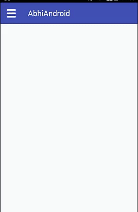
Now run the App and you will see Menu icon and “AbhiAndroid” text written at the top which is created using Toolbar. Now click on menu and three items inside it will be shown. Now click on any of them and corresponding to it layout will open up.
Toolbar Example 2 In Android Studio:
Below is the simple example of Toolbar in which we create a Toolbar and replace it with our ActionBar. In this example we set Logo, title and menu for Toolbar. In our main layout we create a Toolbar and in Activity get the reference of Toolbar and set the title and logo on it. In this we use Activity’s overrided method onCreateOptionsMenu to set the menu items from menu file and onOptionsItemSelected to set click listeners on menu item’s. On click of menu item the title of menu is displayed on the screen with the help of Toast.
Step 1: Create a new project and name it SimpleToolbarExample.
Step 2: Open Gradle Scripts > If you are on the latest version of Android Studio you don’t need to add a compiled dependency for Appcombat v7 21 library if not then please make sure you add the line below in your gradel build dependencies.
apply plugin: 'com.android.application'
android {
compileSdkVersion 24
buildToolsVersion "24.0.1"
defaultConfig {
applicationId "abhiandroid.com.simpletoolbarexample"
minSdkVersion 16
targetSdkVersion 24
versionCode 1
versionName "1.0"
}
buildTypes {
release {
minifyEnabled false
proguardFiles getDefaultProguardFile('proguard-android.txt'), 'proguard-rules.pro'
}
}
}
dependencies {
compile fileTree(dir: 'libs', include: ['*.jar'])
testCompile 'junit:junit:4.12'
compile 'com.android.support:appcompat-v7:24.1.1'
}
Step 3: ActionBars are replaced with Toolbar so we can still use ActionBar but in our example we are going to make a Toolbar so go to your style.xml file and change the theme to “Theme.AppCompat.Light.NoActionBar” This theme helps us get rid of the ActionBar so we can make a Toolbar.
<resources>
    <!-- Base application theme. -->
    <style name="AppTheme" parent="Theme.AppCompat.Light.NoActionBar">
        <!-- Customize your theme here. -->
        <item name="colorPrimary">@color/colorPrimary</item>
        <item name="colorPrimaryDark">@color/colorPrimaryDark</item>
        <item name="colorAccent">@color/colorAccent</item>
    </style>
</resources>
Step 4: Now let’s talk about the color scheme for our application. Open your color.xml file from values folder. In this XML file colorPrimary is the primary color for the app and colorPrimaryDark color is the color of the status bar. We can easily change our colors from this file.
<?xml version="1.0" encoding="utf-8"?>
<resources>
    <color name="colorPrimary">#3F51B5</color>
    <color name="colorPrimaryDark">#303F9F</color>
    <color name="colorAccent">#FF4081</color>
</resources>
Step 5: Open res -> layout -> activity_main.xml (or) main.xml and add following code:
In this step we define a Toolbar in our main XML file and set it’s background color and theme.
<?xml version="1.0" encoding="utf-8"?>
<RelativeLayout xmlns:android="http://schemas.android.com/apk/res/android"
    xmlns:tools="http://schemas.android.com/tools"
    android:layout_width="match_parent"
    android:layout_height="match_parent"
    tools:context="abhiandroid.com.simpletoolbarexample.MainActivity">
    <android.support.v7.widget.Toolbar
        android:id="@+id/toolbar"
        android:layout_width="match_parent"
        android:layout_height="wrap_content"
        android:background="@color/colorPrimary"
        android:theme="@style/ThemeOverlay.AppCompat.Dark" />
</RelativeLayout>
Step 6: Open res -> menu -> menu_main.xml and add following code:
In this step we create 3 menu items that will be displayed on Toolbar.
<menu xmlns:android="http://schemas.android.com/apk/res/android"
    xmlns:app="http://schemas.android.com/apk/res-auto"
    xmlns:tools="http://schemas.android.com/tools"
    tools:context=".MainActivity">
    <!--
        Menu item's that displayed on Toolbar.
    -->
    <item
        android:id="@+id/action_settings"
        android:orderInCategory="100"
        android:title="@string/action_settings"
        app:showAsAction="never" />
    <item
        android:id="@+id/action_search"
        android:icon="@drawable/ic_search"
        android:orderInCategory="200"
        android:title="Search"
        app:showAsAction="ifRoom" />
    <item
        android:id="@+id/action_user"
        android:icon="@drawable/user"
        android:orderInCategory="300"
        android:title="User"
        app:showAsAction="ifRoom" />
</menu>
Step 7: Open src -> package -> MainActivity.java
In this step we open the MainActivity and add the code for initiates the Toolbar.. In this we replace the ActionBar with our ToolBar by using setSupportActionBar() method and also set the tiltle and logo for the Toolbar. After that we implement Activity’s overrided method onCreateOptionsMenu to set the menu items from menu file and onOptionsItemSelected to set click listeners on menu item’s. On click of menu item the tiltle of menu is displayed on the screen with the help of Toast. In this I have added comments in code to help you to understand the code easily so make sure you read the comments.
package abhiandroid.com.simpletoolbarexample;
import android.os.Bundle;
import android.support.v7.app.AppCompatActivity;
import android.support.v7.widget.Toolbar;
import android.view.Menu;
import android.view.MenuItem;
import android.widget.Toast;
public class MainActivity extends AppCompatActivity {
@Override
protected void onCreate(Bundle savedInstanceState) {
super.onCreate(savedInstanceState);
setContentView(R.layout.activity_main);
Toolbar toolbar = (Toolbar) findViewById(R.id.toolbar); // get the reference of Toolbar
toolbar.setTitle("AbhiAndroid"); // set Title for Toolbar
toolbar.setLogo(R.drawable.android); // set logo for Toolbar
setSupportActionBar(toolbar); // Setting/replace toolbar as the ActionBar
}
// Activity's overrided method used to set the menu file
@Override
public boolean onCreateOptionsMenu(Menu menu) {
// Inflate the menu; this adds items to the action bar if it is present.
getMenuInflater().inflate(R.menu.menu_main, menu);
return true;
}
// Activity's overrided method used to perform click events on menu items
@Override
public boolean onOptionsItemSelected(MenuItem item) {
// Handle action bar item clicks here. The action bar will
// automatically handle clicks on the Home/Up button, so long
// as you specify a parent activity in AndroidManifest.xml.
int id = item.getItemId();
//noinspection SimplifiableIfStatement
// Display menu item's title by using a Toast.
if (id == R.id.action_settings) {
Toast.makeText(getApplicationContext(), "Setting Menu", Toast.LENGTH_SHORT).show();
return true;
} else if (id == R.id.action_search) {
Toast.makeText(getApplicationContext(), "Search Menu", Toast.LENGTH_SHORT).show();
return true;
} else if (id == R.id.action_user) {
Toast.makeText(getApplicationContext(), "User Menu", Toast.LENGTH_SHORT).show();
return true;
}
return super.onOptionsItemSelected(item);
}
}
Output:
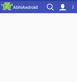
Now run the App and you will see Toolbar at the top. Click on it and message created using Toast will be displayed.
Download This FREE eBook


Download This FREE eBook


Premium Project Source Code:
- Food Ordering Android App Project Source Code
- Ecommerce Store Android App Project Source Code
- Convert Website Into Android App Project Source Code
- Quiz Game Android App Project Source Code
- Radio Streaming Android App Source Code
- City Guide Android App Project Source Code
- QR Barcode Android App Project Source Code

