CardView Tutorial Using RecyclerView Example In Android Studio
In Android, CardView is another main element that can represent the information in a card manner with a drop shadow called elevation and corner radius which looks consistent across the platform. CardView was introduced in Material Design in API level 21 (Android 5.0 i.e Lollipop).

CardView uses elevation property on Lollipop for shadows and falls back to a custom emulated shadow implementation on older platforms.
This new widget is a big step for displaying data/information inside cards. We can easily design good looking UI when we combined CardView with RecyclerView. A CardView is a ViewGroup that can be added in our Activity or Fragment using a layout XML file.
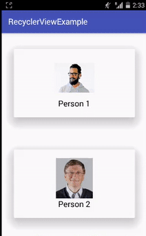
Table Of Contents
Basic CardView XML code In Android Studio:
<android.support.v7.widget.CardView
xmlns:card_view="http://schemas.android.com/apk/res-auto"
android:layout_width="match_parent"
android:layout_height="wrap_content">
</android.support.v7.widget.CardView>
Gradle Dependency to use CardView:
The CardView widget is a part of separate library valid for API 7 level or higher. Add the following dependency in your Gradle build file to use CardView.
Add inside Gradle Scripts > build.gradle (Module: app) and inside dependencies
dependencies {
compile 'com.android.support:cardview-v7:23.0.1'
}

Attributes of CardView In Android:
Now let’s we discuss some common attributes of a CardView that helps us to configure it in our layout (xml).
1. card_view:cardBackgroundColor :
This attribute is used to set the Background color for the CardView. We can also set the background color programmatically using setCardBackgroundColor(int color) method.
Below we set the black color in the background of CardView..
 <android.support.v7.widget.CardView
        android:id="@+id/card_view"
        android:layout_width="250dp"
        android:layout_height="250dp"
        android:layout_gravity="center"
        card_view:cardBackgroundColor="#000">

        <TextView
            android:layout_width="match_parent"
            android:layout_height="match_parent"
            android:text="AbhiAndroid"
            android:textColor="#fff"
            android:textSize="20sp" />

    </android.support.v7.widget.CardView>
 2. card view:cardCornerRadius:
This attribute is used to set the corner radius for the CardView. We can also set the corner radius programmatically using setRadius(float radius) method.
Below we set the black background and corner radius for CardView.
 <android.support.v7.widget.CardView
        android:id="@+id/card_view"
        android:layout_width="250dp"
        android:layout_height="250dp"
        android:layout_gravity="center"
        card_view:cardCornerRadius="20dp"
        card_view:cardBackgroundColor="#000"><!--
    corner radius value 20dp and black background
    -->

        <TextView
            android:layout_width="match_parent"
            android:layout_height="match_parent"
            android:text="AbhiAndroid"
            android:textColor="#fff"
            android:textSize="20sp" />

    </android.support.v7.widget.CardView>
 3. card_view:cardElevation
This attribute is used to set the elevation for the CardView. Elevation is used to show the shadow of the CardView. We can also set the card elevation value programmatically using setCardElevation(float elevation) method.
Below we set the black background and elevation value for the CardView.
<android.support.v7.widget.CardView
        android:id="@+id/card_view"
        android:layout_width="250dp"
        android:layout_height="250dp"
        android:layout_gravity="center"
        card_view:cardElevation="30dp"
        card_view:cardBackgroundColor="#000"><!--
    card elevation value 30dp and black background
    -->

        <TextView
            android:layout_width="match_parent"
            android:layout_height="match_parent"
            android:text="AbhiAndroid"
            android:textColor="#fff"
            android:textSize="20sp" />

    </android.support.v7.widget.CardView>
 4. card_view:contentPadding :
This attribute is used to set the inner padding between the edges of the Card and children of the CardView. This attribute is used to set the equally padding between all the edges of the card and children of the CardView. We can also set the padding from bottom, top, left and right edges. We can also set padding programmatically using setContentPadding(int left, int top, int right, int bottom) method.
Below we set the black background and 20dp value for the inner padding between the edges of the Card and children of the CardView.
<android.support.v7.widget.CardView
        android:id="@+id/card_view"
        android:layout_width="250dp"
        android:layout_height="250dp"
        android:layout_gravity="center"
        card_view:cardBackgroundColor="#000"
        card_view:cardCornerRadius="20dp"
        card_view:cardElevation="30dp"
        card_view:contentPadding="20dp"><!--
    content padding value 20dp and black background
    -->

        <TextView
            android:layout_width="match_parent"
            android:layout_height="match_parent"
            android:text="AbhiAndroid"
            android:textColor="#fff"
            android:textSize="20sp" />

    </android.support.v7.widget.CardView>
5. cardview:contentPaddingBottom :
This attribute is used to set the inner padding between the bottom edge of the card and children of the CardView.
Below we set the black background and 20dp value for the inner padding between the bottom edge of the Card and children of the CardView.
<android.support.v7.widget.CardView
        android:id="@+id/card_view"
        android:layout_width="250dp"
        android:layout_height="250dp"
        android:layout_gravity="center"
        card_view:cardBackgroundColor="#000"
        card_view:cardElevation="10dp"
        card_view:contentPaddingBottom="20dp"><!--
    content bottom padding value 20dp and black background
    -->
        <RelativeLayout
            android:layout_width="match_parent"
            android:layout_height="match_parent">

            <TextView
                android:layout_width="wrap_content"
                android:layout_height="wrap_content"
                android:layout_alignParentBottom="true"
                android:text="AbhiAndroid"
                android:textColor="#fff"
                android:textSize="20sp" />
        </RelativeLayout>

    </android.support.v7.widget.CardView>
6. cardview:contentPaddingLeft :
This attribute is used to set the inner padding between the left edge of the card and children of the CardView.
Below we set the black background and 20dp value for the inner padding between the left edge of the Card and children of the CardView.
 <android.support.v7.widget.CardView
        android:id="@+id/card_view"
        android:layout_width="250dp"
        android:layout_height="250dp"
        android:layout_gravity="center"
        card_view:cardBackgroundColor="#000"
        card_view:cardElevation="10dp"
        card_view:contentPaddingLeft="20dp"><!--
    content left padding value 20dp and black background
    -->
        <RelativeLayout
            android:layout_width="match_parent"
            android:layout_height="match_parent">

            <TextView
                android:layout_width="wrap_content"
                android:layout_height="wrap_content"
                android:text="AbhiAndroid"
                android:textColor="#fff"
                android:textSize="20sp" />
        </RelativeLayout>

    </android.support.v7.widget.CardView>
7. cardview:contentPaddingRight :
This attribute is used to set the inner padding between the right edge of the card and children of the CardView.
Below we set the black background and 20dp value for the inner padding between the right edge of the Card and children of the CardView.
<android.support.v7.widget.CardView
        android:id="@+id/card_view"
        android:layout_width="250dp"
        android:layout_height="250dp"
        android:layout_gravity="center"
        card_view:cardBackgroundColor="#000"
        card_view:cardElevation="10dp"
        card_view:contentPaddingRight="20dp"><!--
    content right padding value 20dp and black background
    -->
        <RelativeLayout
            android:layout_width="match_parent"
            android:layout_height="match_parent">

            <TextView
                android:layout_width="wrap_content"
                android:layout_height="wrap_content"
                android:layout_alignParentRight="true"
                android:text="AbhiAndroid"
                android:textColor="#fff"
                android:textSize="20sp" />
        </RelativeLayout>

    </android.support.v7.widget.CardView>
8. cardview:contentPaddingTop :
This attribute is used to set the inner padding between the top edge of the card and children of the CardView.
Below we set the black background and 20dp value for the inner padding between the top edge of the Card and children of the CardView.
 <android.support.v7.widget.CardView
        android:id="@+id/card_view"
        android:layout_width="250dp"
        android:layout_height="250dp"
        android:layout_gravity="center"
        card_view:cardBackgroundColor="#000"
        card_view:cardElevation="10dp"
        card_view:contentPaddingTop="20dp"><!--
    content left padding value 20dp and black background
    -->
        <RelativeLayout
            android:layout_width="match_parent"
            android:layout_height="match_parent">

            <TextView
                android:layout_width="wrap_content"
                android:layout_height="wrap_content"
                android:text="AbhiAndroid"
                android:textColor="#fff"
                android:textSize="20sp" />
        </RelativeLayout>

    </android.support.v7.widget.CardView>
Important Methods Of CardView:
Let’s we discuss some important methods of CardView that may be called in order to manage the CardView.
1. setCardBackgroundColor(int color) : This method is used to set the background color for the CardView.
Below we set the background color for the CardView.
 // init the CardView
        CardView cardView = (CardView) findViewById(R.id.card_view);
        // set black color for the Background of the CardView
        cardView.setCardBackgroundColor(Color.BLACK);
2. setCardElevation(float): This method is used to set the backward compatible elevation of the CardView. This method sets the value in float type format.
Below we set the backward compatible elevation value of the CardView.
 // init the CardView
        CardView cardView = (CardView) findViewById(R.id.card_view);
        // set black color for the Background of the CardView
        cardView.setCardBackgroundColor(Color.BLACK);
        cardView.setCardElevation(20f); // backward compatible elevation value
3. getCardElevation() : This method is used to get the elevation value which we set using setCardElevation(float) method. This method return a float type value.
Below we firstly set the elevation value and then get the same of CardView.
 // init the CardView
        CardView cardView = (CardView) findViewById(R.id.card_view);
        // set black color for the Background of the CardView
        cardView.setCardBackgroundColor(Color.BLACK);
        cardView.setCardElevation(20f); // set backward compatible elevation value
        float elevationValue=cardView.getCardElevation(); // get the card background compatible elevation value
4. setRadius(float radius) : This method is used to set the corner radius value of the CardView. This method sets the value in float type format.
Below we set the corner radius value of CardView.
 // init the CardView
        CardView cardView = (CardView) findViewById(R.id.card_view);
        // set black color for the Background of the CardView
        cardView.setCardBackgroundColor(Color.BLACK);
        cardView.setRadius(20f); // sets corner radius value
5. getRadius() : This method is used to get the corner radius value that we set using setRadius(float radius) method. This method return a float type value.
Below we firstly set the corner radius value and then get the same of CardView.
// init the CardView
        CardView cardView = (CardView) findViewById(R.id.card_view);
        // set black color for the Background of the CardView
        cardView.setCardBackgroundColor(Color.BLACK);
        cardView.setRadius(20f); // sets corner radius value
        float radiusValue=cardView.getRadius(); // get the corner radius value
6. setContentPadding(int left, int top, int right, int bottom) : This method is used to set the padding betweeen the card’s edges and the children of the CardView. This method sets the int type value for the content padding. This method set the equally padding between all the edges of the card and children of the CardVie
Below we set the value of padding between the card’s edges and the children of the CardView.
// init the CardView
        CardView cardView = (CardView) findViewById(R.id.card_view);
        // set black color for the Background of the CardView
        cardView.setCardBackgroundColor(Color.BLACK);
        cardView.setContentPadding(10,10,10,10); // set the padding between the card's edges and the children of the CardView
7. getContentPaddingBottom() : This method is used to get the inner padding before the Card’s bottom edge. This method returns an int type value.
Below we firstly set the content padding and then get the inner padding before the Card’s bottom edge.
// init the CardView
        CardView cardView = (CardView) findViewById(R.id.card_view);
        // set black color for the Background of the CardView
        cardView.setCardBackgroundColor(Color.BLACK);
        cardView.setContentPadding(10, 10, 10, 10); // set the padding between the card's edges and the children of the CardView
        int bottomPadding = cardView.getPaddingBottom(); // get the inner padding before the Card's bottom edge.
8. getContentPaddingLeft() : This method is used to get the inner padding after the Card’s left edge. This method returns an int type value.
Below we firstly set the content padding and then get the inner padding after the Card’s left edge.
// init the CardView
        CardView cardView = (CardView) findViewById(R.id.card_view);
        // set black color for the Background of the CardView
        cardView.setCardBackgroundColor(Color.BLACK);
        cardView.setContentPadding(10, 10, 10, 10); // set the padding between the card's edges and the children of the CardView
        int leftPadding = cardView.getPaddingLeft(); // get the inner padding after the Card's left edge.
9. getContentPaddingRight() : This method is used to get the inner padding before the Card’s right edge. This method returns an int type value.
Below we firstly set the content padding and then get the inner padding before the Card’s right edge.
 // init the CardView
        CardView cardView = (CardView) findViewById(R.id.card_view);
        // set black color for the Background of the CardView
        cardView.setCardBackgroundColor(Color.BLACK);
        cardView.setContentPadding(10, 10, 10, 10); // set the padding between the card's edges and the children of the CardView
        int rightPadding = cardView.getPaddingLeft(); // get the inner padding before the Card's right edge.
10. getContentPaddingTop() : This method is used to get the inner padding after the Card’s top edge. This method returns an int type value.
Below we firstly set the content padding and then get the inner padding after the Card’s top edge.
 // init the CardView
        CardView cardView = (CardView) findViewById(R.id.card_view);
        // set black color for the Background of the CardView
        cardView.setCardBackgroundColor(Color.BLACK);
        cardView.setContentPadding(10, 10, 10, 10); // set the padding between the card's edges and the children of the CardView
        int topPadding = cardView.getPaddingLeft(); // get the inner padding after the Card's top edge.
CardView Example Using RecyclerView as GridView in Android Studio:
Below is the example of RecyclerView As GridView in which we display list of Person Names with their images with default vertical orientation by using RecyclerView. In this example we are using LinearLayoutManager with default vertical orientation to display the items. Firstly we declare a RecyclerView in our XML file and then get the reference of it in our Activity. After that we creates two ArrayList‘s for Person Names and Images. After that we set a LinearLayoutManager and finally we set the Adapter to show the list items in RecyclerView. Whenever a user clicks on an item the full size image will be displayed on the next screen.
Below you can download code, see final output and step by step explanation of the example:
Download Code (Password: abhiandroid)
Step 1: Create a New Project And Name It RecyclerViewExample.
Step 2: Open Gradle Scripts > build.gradle (Module: app) and add RecyclerView & CardView Library dependency in it.
 apply plugin: 'com.android.application'
android {
    compileSdkVersion 24
    buildToolsVersion "24.0.1"
    defaultConfig {
        applicationId "abhiandroid.com.recyclerviewexample"
        minSdkVersion 16
        targetSdkVersion 24
        versionCode 1
        versionName "1.0"
    }
    buildTypes {
        release {
            minifyEnabled false
            proguardFiles getDefaultProguardFile('proguard-android.txt'), 'proguard-rules.pro'
        }
    }
}
dependencies {
    compile fileTree(dir: 'libs', include: ['*.jar'])
    testCompile 'junit:junit:4.12'
    compile 'com.android.support:appcompat-v7:24.1.1'
    compile "com.android.support:recyclerview-v7:23.0.1" // dependency file for RecyclerView
    compile 'com.android.support:cardview-v7:23.0.1' // CardView dependency file

}
Step 3: Open res -> layout -> activity_main.xml (or) main.xml and add following code:
In this step we create a RecyclerView in our XML file.
 <?xml version="1.0" encoding="utf-8"?>
<RelativeLayout xmlns:android="http://schemas.android.com/apk/res/android"
    xmlns:tools="http://schemas.android.com/tools"
    android:layout_width="match_parent"
    android:layout_height="match_parent"
    tools:context="abhiandroid.com.recyclerviewexample.MainActivity">

    <android.support.v7.widget.RecyclerView
        android:id="@+id/recyclerView"
        android:layout_width="match_parent"
        android:layout_height="wrap_content" />
</RelativeLayout>
Step 4: Create a new XML file rowlayout.xml for list item of RecyclerView and paste the following code in it.
In this step we create a new xml file for item row in which we creates a TextView and ImageView to show the data in grid format. In this we define the views inside CardView to display the items in the form of cards.
 <android.support.v7.widget.CardView android:id="@+id/card_view"
    android:layout_width="match_parent"
    android:layout_height="wrap_content"
    card_view:cardElevation="20dp"
    android:layout_margin="10dp"
    card_view:contentPadding="20dp"
    xmlns:card_view="http://schemas.android.com/apk/res-auto"
    xmlns:tools="http://schemas.android.com/tools"
    xmlns:android="http://schemas.android.com/apk/res/android">

        <RelativeLayout
            android:layout_width="match_parent"
            android:layout_height="wrap_content"
            android:layout_gravity="center">

            <ImageView
                android:id="@+id/image"
                android:layout_width="100dp"
                android:layout_height="100dp"
                android:layout_centerHorizontal="true"
                android:src="@drawable/person1" />


            <TextView
                android:id="@+id/name"
                android:layout_width="wrap_content"
                android:layout_height="wrap_content"
                android:layout_below="@+id/image"
                android:layout_centerHorizontal="true"
                android:linksClickable="true"
                android:text="https://abhiandroid.com"
                android:textColor="#000"
                android:textSize="20sp" />
        </RelativeLayout>

    </android.support.v7.widget.CardView>
Step 5 : Now open app -> java -> package -> MainActivity.java and add the below code.
In this step firstly we get the reference of RecyclerView. After that we creates two ArrayList‘s for Person Names and Images. After that we set a LinearLayoutManager and finally we set the Adapter to show the list items in RecyclerView.
package abhiandroid.com.recyclerviewexample;
import android.os.Bundle;
import android.support.v7.app.AppCompatActivity;
import android.support.v7.widget.GridLayoutManager;
import android.support.v7.widget.LinearLayoutManager;
import android.support.v7.widget.RecyclerView;

import java.util.ArrayList;
import java.util.Arrays;

public class MainActivity extends AppCompatActivity {

// ArrayList for person names
ArrayList personNames = new ArrayList<>(Arrays.asList("Person 1", "Person 2", "Person 3", "Person 4", "Person 5", "Person 6", "Person 7","Person 8", "Person 9", "Person 10", "Person 11", "Person 12", "Person 13", "Person 14"));
ArrayList personImages = new ArrayList<>(Arrays.asList(R.drawable.person1, R.drawable.person2, R.drawable.person3, R.drawable.person4, R.drawable.person5, R.drawable.person6, R.drawable.person7,R.drawable.person1, R.drawable.person2, R.drawable.person3, R.drawable.person4, R.drawable.person5, R.drawable.person6, R.drawable.person7));

@Override
protected void onCreate(Bundle savedInstanceState) {
super.onCreate(savedInstanceState);
setContentView(R.layout.activity_main);
// get the reference of RecyclerView
RecyclerView recyclerView = (RecyclerView) findViewById(R.id.recyclerView);
// set a LinearLayoutManager with default vertical orientaion
LinearLayoutManager linearLayoutManager = new LinearLayoutManager(getApplicationContext());
recyclerView.setLayoutManager(linearLayoutManager); // set LayoutManager to RecyclerView
// call the constructor of CustomAdapter to send the reference and data to Adapter
CustomAdapter customAdapter = new CustomAdapter(MainActivity.this, personNames,personImages);
recyclerView.setAdapter(customAdapter); // set the Adapter to RecyclerView
}
}
Step 6: Create a new class CustomAdapter.java inside package and add the following code.
In this step we create a CustomAdapter class and extends RecyclerView.Adapter class with Viewholder in it. After that we implement the overrided methods and create a constructor for getting the data from Activity.
In this custom Adapter two methods are important: First is onCreateViewHolder in which we inflate the layout item xml and pass it to View Holder and other is onBindViewHolder in which we set the data in the view’s with the help of ViewHolder. Finally we implement the setOnClickListener event on itemview and on click of item we display the selected image in full size in the next Activity.
package abhiandroid.com.recyclerviewexample;
import android.content.Context;
import android.content.Intent;
import android.support.v7.widget.RecyclerView;
import android.view.LayoutInflater;
import android.view.View;
import android.view.ViewGroup;
import android.widget.ImageView;
import android.widget.TextView;

import java.util.ArrayList;

public class CustomAdapter extends RecyclerView.Adapter {

ArrayList personNames;
ArrayList personImages;
Context context;

public CustomAdapter(Context context, ArrayList personNames, ArrayList personImages) {
this.context = context;
this.personNames = personNames;
this.personImages = personImages;
}

@Override
public MyViewHolder onCreateViewHolder(ViewGroup parent, int viewType) {
// infalte the item Layout
View v = LayoutInflater.from(parent.getContext()).inflate(R.layout.rowlayout, parent, false);
// set the view's size, margins, paddings and layout parameters
MyViewHolder vh = new MyViewHolder(v); // pass the view to View Holder
return vh;
}

@Override
public void onBindViewHolder(MyViewHolder holder, final int position) {
// set the data in items
holder.name.setText(personNames.get(position));
holder.image.setImageResource(personImages.get(position));
// implement setOnClickListener event on item view.
holder.itemView.setOnClickListener(new View.OnClickListener() {
@Override
public void onClick(View view) {
// open another activity on item click
Intent intent = new Intent(context, SecondActivity.class);
intent.putExtra("image", personImages.get(position)); // put image data in Intent
context.startActivity(intent); // start Intent
}
});

}

@Override
public int getItemCount() {
return personNames.size();
}

public class MyViewHolder extends RecyclerView.ViewHolder {
// init the item view's
TextView name;
ImageView image;

public MyViewHolder(View itemView) {
super(itemView);

// get the reference of item view's
name = (TextView) itemView.findViewById(R.id.name);
image = (ImageView) itemView.findViewById(R.id.image);

}
}
}
Step 7: Create a new XML file activity_second.xml and add below code in it.
In this step we create a ImageView in our XML file to show the selected image in full size.
<?xml version="1.0" encoding="utf-8"?>
<RelativeLayout xmlns:android="http://schemas.android.com/apk/res/android"
    xmlns:tools="http://schemas.android.com/tools"
    android:layout_width="match_parent"
    android:layout_height="match_parent"
    android:paddingBottom="@dimen/activity_vertical_margin"
    android:paddingLeft="@dimen/activity_horizontal_margin"
    android:paddingRight="@dimen/activity_horizontal_margin"
    android:paddingTop="@dimen/activity_vertical_margin"
    android:background="#fff">

    <ImageView
        android:id="@+id/selectedImage"
        android:layout_width="match_parent"
        android:layout_height="wrap_content"
        android:layout_centerInParent="true"
        android:scaleType="fitXY" />
</RelativeLayout>
Step 8: Create a new Activity and name it SecondActivity.class and add the below code in it.
In this step we get the reference of ImageView and then get Intent which was set from adapter of Previous Activity and then finally we set the image in ImageView.
package abhiandroid.com.recyclerviewexample;
import android.content.Intent;
import android.os.Bundle;
import android.support.v7.app.AppCompatActivity;
import android.widget.ImageView;

public class SecondActivity extends AppCompatActivity {

ImageView selectedImage;

@Override
protected void onCreate(Bundle savedInstanceState) {
super.onCreate(savedInstanceState);
setContentView(R.layout.activity_second);
selectedImage = (ImageView) findViewById(R.id.selectedImage); // init a ImageView
Intent intent = getIntent(); // get Intent which we set from Previous Activity
selectedImage.setImageResource(intent.getIntExtra("image", 0)); // get image from Intent and set it in ImageView
}
}
Output:
Now run the App and you can see person names with their images with default vertical orientation in Card style. Click on any image and it will open in large size.
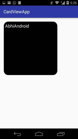
CardView Example 2 in Android Studio:
Below is the example of CardView in which we display the data/information in a Card. In this example we use ImageView and TextView inside a card. Whenever a user click on the card a message “CardView clicked event ” is displayed on the screen with the help of Toast.
Below you can download code, see final output and step by step explanation of the example:
Step 1: Create a new project and name it CardViewExample.
Step 2: Open Gradle Scripts > build.gradle and add CardView Library dependency in it.
apply plugin: 'com.android.application'
android {
    compileSdkVersion 25
    buildToolsVersion "25.0.3"
    defaultConfig {
        applicationId "abhiandroid.com.cardviewexample"
        minSdkVersion 15
        targetSdkVersion 25
        versionCode 1
        versionName "1.0"
        testInstrumentationRunner "android.support.test.runner.AndroidJUnitRunner"
    }
    buildTypes {
        release {
            minifyEnabled false
            proguardFiles getDefaultProguardFile('proguard-android.txt'), 'proguard-rules.pro'
        }
    }
}

dependencies {
    compile fileTree(dir: 'libs', include: ['*.jar'])
    androidTestCompile('com.android.support.test.espresso:espresso-core:2.2.2', {
        exclude group: 'com.android.support', module: 'support-annotations'
    })
    compile 'com.android.support:appcompat-v7:25.3.1'
    compile 'com.android.support.constraint:constraint-layout:1.0.2'
    testCompile 'junit:junit:4.12'
    compile 'com.android.support:cardview-v7:23.0.1' // CardView dependency file
}
Step 3: Open res -> layout -> activity_main.xml (or) main.xml and add following code:
In this step we create a ImageView and a TextView inside our CardView. We also use elevation, background and other attributes of CardView.
 <LinearLayout xmlns:android="http://schemas.android.com/apk/res/android"
    xmlns:card_view="http://schemas.android.com/apk/res-auto"
    xmlns:tools="http://schemas.android.com/tools"
    android:layout_width="match_parent"
    android:layout_height="match_parent"
    android:orientation="vertical">

    <android.support.v7.widget.CardView
        android:id="@+id/card_view"
        android:layout_width="250dp"
        android:layout_height="250dp"
        android:layout_gravity="center"
        card_view:cardBackgroundColor="#000"
        card_view:cardElevation="20dp"
        card_view:contentPadding="20dp">

        <RelativeLayout
            android:layout_width="match_parent"
            android:layout_height="wrap_content"
            android:layout_gravity="center">

            <ImageView
                android:id="@+id/imageView"
                android:layout_width="wrap_content"
                android:layout_height="wrap_content"
                android:layout_centerHorizontal="true"
                android:src="@drawable/abhiandroid" />


            <TextView
                android:layout_width="wrap_content"
                android:layout_height="wrap_content"
                android:layout_below="@+id/imageView"
                android:layout_centerHorizontal="true"
                android:linksClickable="true"
                android:text="https://abhiandroid.com"
                android:textColor="#fff"
                android:textSize="20sp" />
        </RelativeLayout>

    </android.support.v7.widget.CardView>

</LinearLayout>
Step 4 : Now open app -> java -> package -> MainActivity.java and add the below code.
In this step firstly we get the reference of CardView and then set the corner radius value.Finally we implement the onClickListener event on CardView so that if a user clicks on CardView a message “CardView clicked event” is displayd on the screen by using a Toast.
package abhiandroid.com.cardviewexample;
import android.os.Bundle;
import android.support.v7.app.AppCompatActivity;
import android.support.v7.widget.CardView;
import android.view.View;
import android.widget.Toast;

public class MainActivity extends AppCompatActivity {


    @Override
    protected void onCreate(Bundle savedInstanceState) {
        super.onCreate(savedInstanceState);
        setContentView(R.layout.activity_main);
        // init the CardView
        CardView cardView = (CardView) findViewById(R.id.card_view);
        cardView.setRadius(20F); // set corner radius value
        // Implement onClickListener event on CardView
        cardView.setOnClickListener(new View.OnClickListener() {
            @Override
            public void onClick(View v) {
                Toast.makeText(MainActivity.this, "CardView clicked event ", Toast.LENGTH_LONG).show();
            }
        });

    }
}
Output:
Now run the App and you will see simple CardView which will display the information.
Download This FREE eBook


Download This FREE eBook


Premium Project Source Code:
- Food Ordering Android App Project Source Code
- Ecommerce Store Android App Project Source Code
- Convert Website Into Android App Project Source Code
- Quiz Game Android App Project Source Code
- Radio Streaming Android App Source Code
- City Guide Android App Project Source Code
- QR Barcode Android App Project Source Code

