CheckedTextView Tutorial With Example In Android Studio
In Android, CheckedTextView is an extension of normal TextView that supports the checkable interface and displays it. It has a checkbox along with some text. It is mainly used in a ListView where we want to show which item is selected or not. checkmark attribute is used to provide a graphic or a drawable to CheckedTextView.
Important Note: In CheckedTextView we have to set android:checkMark attribute to provide a graphic or drawable otherwise it will not show the check mark and behaves like a normal TextView. Another thing is we can’t change the state of check mark only by clicking on the UI, instead we have to use a listener to do that. We will be explaining all these below.
Basic CheckedTextView code in XML:
Very Important Note: Before using any code on this article make sure to download this image and save it in your drawable folder named as checked. You can also download the image by click on it below.
<!--Make sure to download checked image and save in your drawable folder-->
<CheckedTextView
android:id="@+id/simpleCheckedTextView"
android:layout_width="fill_parent"
android:layout_height="wrap_content"
android:checked="true"
android:gravity="center"
android:checkMark="@drawable/checked"
android:text="Checked Text View" />
Table Of Contents
Getting Current State Of CheckedTextView:
isChecked(boolean): This method is used to get the current state of the CheckedTextView. This methods returns a Boolean type value means true or false. It returns true if a CheckedTextView is currently checked and returns false if it is not.
Below is an example code in which we check the current state of the CheckedTextView.
CheckedTextView simpleCheckedTextView = (CheckedTextView) findViewById(R.id.simpleCheckedTextView); // initiate a CheckedTextView
Boolean checkedValue = simpleCheckedTextView.isChecked(); // check current state of CheckedTextView
Attributes of CheckedTextView:
Now let’s we discuss some important attributes that helps us to configure a CheckedTextView in your xml file.
1. id: This attribute is used to uniquely identify a CheckedTextView.
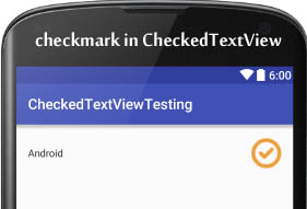
2. checkmark: This attribute is used to set the drawable for the check mark.
PS: First save the image name as checked in drawable folder before using below code.
<CheckedTextView
android:id="@+id/simpleCheckedTextView"
android:layout_width="fill_parent"
android:layout_height="wrap_content"
android:checkMark="@drawable/checked"
android:checked="true"
android:gravity="center"
android:text="Android" /><!-- bottom drawable of a CheckedTextView -->
Setting checkMark In Java Class:
CheckedTextView simpleCheckedTextView = (CheckedTextView) findViewById(R.id.simpleCheckedTextView); // initiate a CheckedTextView
simpleCheckedTextView.setCheckMarkDrawable(R.drawable.checked); // set drawwable for check mark for CheckedTextView
3. checked: This attribute is used to set the current state of the CheckedTextView. We can also change the state in Java class by using setChecked() method. By default the value of this attribute is false.
In the above code of checkMark we also used this attribute.
Setting checked property In Java Class:
Use the below code to set the checked property to true programmatically.
CheckedTextView simpleCheckedTextView = (CheckedTextView) findViewById(R.id.simpleCheckedTextView); // initiate a CheckedTextView
simpleCheckedTextView.setChecked(true); // set current state to true for CheckedTextView
4. text: This attribute is used to set the text in a CheckedTextView. We can set the text in xml as well as in the java class. In the above code of checkMark we also used text attribute.
Setting text of CheckedTextView In Java class:
CheckedTextView simpleCheckedTextView = (CheckedTextView) findViewById(R.id.simpleCheckedTextView); // initiate a CheckedTextView
simpleCheckedTextView.setText("AbhiAndroid"); // set AbhiAndroid text for CheckedTextView
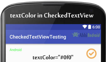
5. textColor: This attribute is used to set the text color of a CheckedTextView. Color value is in the form of “#argb”, “#rgb”, “#rrggbb”, or “#aarrggbb”.
Below we set the green color for the displayed text of a CheckedTextView.
<CheckedTextView
android:id="@+id/simpleCheckedTextView"
android:layout_width="fill_parent"
android:layout_height="wrap_content"
android:checked="true"
android:checkMark="@drawable/checked"
android:textColor="#0f0"
android:text="Android" /> <!-- green text  color for CheckedTextView -->
Setting textColor Of CheckTextView Text In Java class:
CheckedTextView simpleCheckedTextView = (CheckedTextView) findViewById(R.id.simpleCheckedTextView); // initiate a CheckedTextView
simpleCheckedTextView.setTextColor(Color.GREEN); // set green text color for CheckedTextView
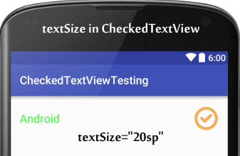
6. textSize: This attribute is used to set the size of text of a CheckedTextView. We can set the text size in sp(scale independent pixel) or in dp(density pixel).
Below we set the 20 sp size for the text of a CheckedTextView.
<CheckedTextView
android:id="@+id/simpleCheckedTextView"
android:layout_width="fill_parent"
android:layout_height="wrap_content"
android:checked="true"
android:gravity="center"
android:checkMark="@drawable/checked"
android:textColor="#0f0"
android:textSize="20sp"
android:text="Android" /> <!-- 20 sp displayed text Size of a CheckedTextView -->
Setting text Size of CheckedTextView Text In Java class:
CheckedTextView simpleCheckedTextView = (CheckedTextView) findViewById(R.id.simpleCheckedTextView); // initiate a CheckedTextView
simpleCheckedTextView.setTextSize(20); // set text size for CheckedTextView
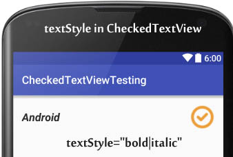
7. textStyle: This attribute is used to set the style for the text of a CheckedTextView. The possible text styles are bold, italic and normal. If we need to use two or more styles for a text view then “|” operator is used for that.
Below we set the bold and italic text styles for the text of CheckedTextView.
<CheckedTextView
android:id="@+id/simpleCheckedTextView"
android:layout_width="fill_parent"
android:layout_height="wrap_content"
android:checked="true"
android:checkMark="@drawable/checked"
android:textSize="20sp"
android:text="Android"
android:textStyle="bold|italic"/> <!-- bold and italic text style for a CheckedTextView -->
8. background: This attribute is used to set the background of a CheckedTextView. We can set a color or a drawable in the background of a CheckedTextView.
Below we set the black color for the background, white color for the displayed text of a CheckedTextView.
<CheckedTextView
android:id="@+id/simpleCheckedTextView"
android:layout_width="fill_parent"
android:layout_height="wrap_content"
android:checked="true"
android:checkMark="@drawable/checked"
android:textColor="#fff"
android:background="#000"
android:textSize="20sp"
android:text="AbhiAndroid"
android:textStyle="bold|italic"/> <!-- black background of a CheckedTextView -->
Setting Background of CheckedTextView In Java class:
CheckedTextView simpleCheckedTextView = (CheckedTextView) findViewById(R.id.simpleCheckedTextView); // initiate a CheckedTextView
simpleCheckedTextView.setBackgroundColor(Color.BLACK); // set black background for CheckedTextView

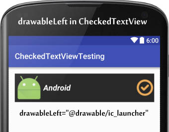
9. drawableBottom, drawableTop, drawableRight And drawableLeft: These attribute draw the drawable below, top, right and left of the text of CheckedTextView.
Below we save the ic_launcher image in drawable folder and then use it to set as drawableLeft. In the similar way you can try for other three attribute yourself.
<CheckedTextView
    android:id="@+id/simpleCheckedTextView"
    android:layout_width="fill_parent"
    android:layout_height="wrap_content"
    android:checked="true"
    android:gravity="center"
    android:checkMark="@drawable/checked"
    android:textColor="#fff"
    android:background="#000"
    android:textSize="20sp"
    android:text="Android"
    android:drawableLeft="@drawable/ic_launcher"
    android:textStyle="bold|italic"/> <!-- bottom drawable of a CheckedTextView -->
CheckedTextView Example In Android Studio
EXAMPLE 1: CHECKEDTEXTVIEW WITH LISTVIEW EXAMPLE IN ANDROID STUDIO
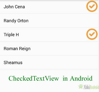
Below is the example of CheckedTextView in which we display a list of Superstar names in CheckedTexView by using BaseAdapter. In this we change the current state of the CheckedTextView on click event. Whenever a user clicks on this CheckedTextView the current state is changed and checked or unchecked value is displayed by using a Toast.
Below you can download complete Android Studio project code, final output and step by step explanation:

Step 1: Create a new project and name it CheckedTextViewExample
Step 2: Open res -> layout ->activity_main.xml (or) main.xml and add following code for displaying a ListView:
<RelativeLayout xmlns:android="http://schemas.android.com/apk/res/android"
xmlns:tools="http://schemas.android.com/tools"
android:layout_width="match_parent"
android:layout_height="match_parent"
tools:context=".MainActivity">

<ListView
android:layout_width="fill_parent"
android:layout_height="fill_parent"
android:id="@+id/listView"/>

</RelativeLayout>
Step 3: Create a new xml list_items.xml inside layout and add the below code for displaying a CheckedTextView by using its different Attributes:
<?xml version="1.0" encoding="utf-8"?>
<LinearLayout xmlns:android="http://schemas.android.com/apk/res/android"
android:layout_width="match_parent"
android:layout_height="match_parent"
android:orientation="vertical">

<CheckedTextView
android:id="@+id/simpleCheckedTextView"
android:layout_width="fill_parent"
android:layout_height="50dp"
android:checked="false"
android:gravity="center_vertical"
android:paddingLeft="15dp"
android:textColor="#000"
android:text="Checked Text View Example" />
<!-- CheckedTextView In Android -->
</LinearLayout>
Step 4: Open src -> package -> MainActivity.java
In this step we add the code for initiate the ListView and then set the adapter to fill the data in the ListView from a String Array.
package example.abhiandroid.checkedtextviewexample;

import android.os.Bundle;
import android.support.v7.app.AppCompatActivity;
import android.view.Menu;
import android.view.MenuItem;
import android.widget.ListView;

public class MainActivity extends AppCompatActivity {

    String value;
    String[] superStarNames = {"John Cena", "Randy Orton", "Triple H", "Roman Reign", "Sheamus"};

    @Override
    protected void onCreate(Bundle savedInstanceState) {
        super.onCreate(savedInstanceState);
        setContentView(R.layout.activity_main);
        // initiate a ListView
        ListView listView = (ListView) findViewById(R.id.listView);
        // set the adapter to fill the data in ListView
        CustomAdapter customAdapter = new CustomAdapter(getApplicationContext(), superStarNames);
        listView.setAdapter(customAdapter);
    }


}
Step 5: Create a new class CustomAdapter.java inside package and add the following code
In this we extend BaseAdapter to fill the data in the ListView and then perform click event on list items. Whenever a user clicks on the CheckedTextView the current state is changed and checked or unchecked value is displayed by using a Toast.
package example.abhiandroid.checkedtextviewexample;

import android.content.Context;
import android.view.LayoutInflater;
import android.view.View;
import android.view.ViewGroup;
import android.widget.BaseAdapter;
import android.widget.CheckedTextView;
import android.widget.Toast;

public class CustomAdapter extends BaseAdapter {
String[] names;
Context context;
LayoutInflater inflter;
String value;

public CustomAdapter(Context context, String[] names) {
this.context = context;
this.names = names;
inflter = (LayoutInflater.from(context));

}

@Override
public int getCount() {
return names.length;
}

@Override
public Object getItem(int position) {
return null;
}

@Override
public long getItemId(int position) {
return 0;
}

@Override
public View getView(int position, View view, ViewGroup parent) {
view = inflter.inflate(R.layout.list_view_items, null);
final CheckedTextView simpleCheckedTextView = (CheckedTextView) view.findViewById(R.id.simpleCheckedTextView);
simpleCheckedTextView.setText(names[position]);
// perform on Click Event Listener on CheckedTextView
simpleCheckedTextView.setOnClickListener(new View.OnClickListener() {
@Override
public void onClick(View v) {
if (simpleCheckedTextView.isChecked()) {
// set cheek mark drawable and set checked property to false
value = "un-Checked";
simpleCheckedTextView.setCheckMarkDrawable(0);
simpleCheckedTextView.setChecked(false);
} else {
// set cheek mark drawable and set checked property to true
value = "Checked";
simpleCheckedTextView.setCheckMarkDrawable(R.drawable.checked);
simpleCheckedTextView.setChecked(true);
}
Toast.makeText(context, value, Toast.LENGTH_SHORT).show();
}
});
return view;
}
}
Output:
Now run the App and you will see WWE Superstar names listed in ListView. Now click on any Superstar and you will notice checkbox will appear on the right side. When you re-click on the same selected name, the checkbox will dis-appear.
9 thoughts on “CheckedTextView Tutorial With Example In Android Studio”
Leave a Reply to Jo Cancel reply
Premium Project Source Code:
- Food Ordering Android App Project Source Code
- Ecommerce Store Android App Project Source Code
- Convert Website Into Android App Project Source Code
- Quiz Game Android App Project Source Code
- Radio Streaming Android App Source Code
- City Guide Android App Project Source Code
- QR Barcode Android App Project Source Code
Thanks you for the tutorial… i just misslead with Arrayadapter.
You save my life.
I have this all working, thanks for a great example. Now I need to get the Text values of the items that are checked and save them to a Sharred Preference.
Lets say I have a SAVE image button. when the user clicks Save, I need to build a string that has the values from the list items but since the items are in the custom adapter, I really don’t know how to get at the values.
Any help is appreciated
hullo sir when i click back buton checked text view does not maintain it state.any solution plzz
sooooo thankes, you teach step by step and complete.
What if I have to check only one option at a time?
I’ve tried ListView.setChoiceMode (ListView. CHOICE_MODE_SINGLE) in the activity
as well as android:choiceMode=”singleChoice” in XML, and both ways don’t work.
Please help.
Hello Prem, CheckedTextView is not for that purpose so if you need to check only one item from the list of items then simply use a TextView and set Drawable Right i.e a checked image at run time on List view’s item click listener event. Firstly create a list and perform setOnItemClickListener event. After that notify your list using notifyDataSetChanged() method and then finally set the DrawableRight of TextView according to the position of item.
Thanks! great help.
And what if I have to clear the selection (deselect all the selected views) in the listView?
to deselect the selected items, this works for me: CheckBox oneCheckBox = ( CheckBox) findViewById(R.id.check_box_one);
oneCheckBox.setChecked(false);
where one CheckBox is the name of my check box and check_box_one is the id of my check box.