ToggleButton (On/Off) Tutorial With Example In Android
In Android, ToggleButton is used to display checked and unchecked state of a button. ToggleButton basically an off/on button with a light indicator which indicate the current state of toggle button. The most simple example of ToggleButton is doing on/off in sound, Bluetooth, wifi, hotspot etc. It is a subclass of compoundButton.
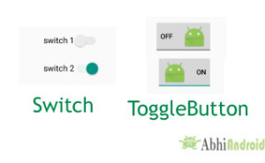
ToggleButton allow the users to change the setting between two states like turn on/off your wifi, Bluetooth etc from your phone’s setting menu. Since, Android 4.0 version ( API level 14 ) there is an another kind of ToggleButton called Switch which provide the user slider control. You can learn more about it reading Switch tutorial.
ToggleButton code in XML:
<ToggleButton
android:id="@+id/simpleToggleButton"
android:layout_width="wrap_content"
android:layout_height="wrap_content"/>
How To Check Current State Of ToggleButton:
To check current state of a toggle button programmatically we use isChecked() method. This method returns a Boolean value either true or false. If a toggle button is checked then it returns true otherwise it returns false. Below is the code which checks the current state of a toggle button.
/*Add in Oncreate() funtion after setContentView()*/
ToggleButton simpleToggleButton = (ToggleButton) findViewById(R.id.simpleToggleButton); // initiate a toggle button
Boolean ToggleButtonState = simpleToggleButton.isChecked(); // check current state of a toggle button (true or false).
Table Of Contents
Attributes of ToggleButton:
Now let’s we discuss important attributes that helps us to configure a Toggle Button in XML file (layout).
1. id: id is an attribute used to uniquely identify a toggle button.
<ToggleButton
android:id="@+id/simpleToggleButton"
android:layout_width="wrap_content"
android:layout_height="wrap_content"/>
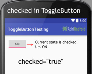
2. checked: checked is an attribute of toggle button used to set the current state of a toggle button. The value should be true or false where true shows the checked state and false shows unchecked state of a toggle button. The default value of checked attribute is false. We can also set the current state programmatically.
Below we set true value for checked attribute sets the current state to checked.
<ToggleButton
    android:id="@+id/simpleToggleButton"
    android:layout_width="wrap_content"
    android:layout_height="wrap_content"
    android:checked="true" /><!-- set the current state of the toggle button-->
Below we set the current state of toggle button to checked:
/*Add in Oncreate() funtion after setContentView()*/
ToggleButton simpleToggleButton = (ToggleButton) findViewById(R.id.simpleToggleButton); // initiate a toggle button
simpleToggleButton.setChecked(true); // set the current state of a toggle button
3. gravity: The gravity attribute is an optional attribute which is used to control the alignment of the text in ToogleButton like left, right, center, top, bottom, center_vertical, center_horizontal etc.
<ToggleButton
    android:id="@+id/simpleToggleButton"
    android:layout_width="fill_parent"
    android:layout_height="wrap_content"
    android:layout_centerHorizontal="true"
    android:checked="true"
    android:gravity="right|center_vertical"/><!-- gravity of the toggle button-->

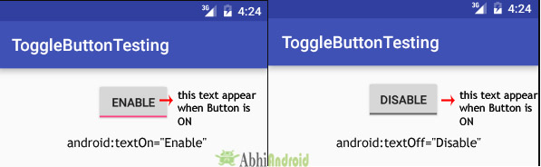
Below is the example code with explanation included in which we set the textOn “Enabble Attribute Of Toggle button” for a toggle button.
<ToggleButton
    android:id="@+id/simpleToggleButton"
    android:layout_width="wrap_content"
    android:layout_height="wrap_content"
    android:checked="true"
    android:layout_centerHorizontal="true"
    android:textOff="Disable"
    android:textOn="Enable"/> <!--text to be displayed whenever toggle button is checked-->
/*Add in Oncreate() funtion after setContentView()*/
// initiate toggle button
ToggleButton simpleToggleButton = (ToggleButton) findViewById(R.id.simpleToggleButton);
// displayed text of the toggle button whenever it is in checked or on state
simpleToggleButton.setTextOn("TextOn Attribute Of Toggle b3`utton");
// displayed text of the toggle button whenever it is in unchecked or off state
simpleToggleButton.setTextOff("TextOff Attribute Of Toggle b3`utton");
5. textColor: textColor attribute is used to set the text color of a toggle button. Color value is in the form of “#argb”, “#rgb”, “#rrggbb”, or “#aarrggbb”.
Below we set the red color for the displayed text of a Toggle button.
<ToggleButton
    android:id="@+id/simpleToggleButton"
    android:layout_width="wrap_content"
    android:layout_height="wrap_content"
    android:checked="false"
    android:textOff="On State"
    android:textOn="Off State"
    android:layout_centerHorizontal="true"
    android:textColor="#f00" /><!--red color for displayed text-->

/*Add in Oncreate() funtion after setContentView()*/
ToggleButton simpleToggleButton = (ToggleButton) findViewById(R.id.simpleToggleButton);// initiate toggle button
simpleToggleButton.setTextColor(Color.RED); //red color for displayed text of toggle button
6. textSize: textSize attribute set the size of the text of a toggle button. We can set the text size in sp(scale independent pixel) or dp(density pixel).
Below we set the 25sp size for the text of a toggle button.
<ToggleButton
    android:id="@+id/simpleToggleButton"
    android:layout_width="wrap_content"
    android:layout_height="wrap_content"
    android:checked="false"
    android:textOff="On State"
    android:textOn="Off State"
    android:layout_centerHorizontal="true"
    android:textColor="#f00"
    android:textSize="25sp"/> <!-- 25sp displayed text size-->

/*Add in Oncreate() funtion after setContentView()*/
ToggleButton simpleToggleButton = (ToggleButton) findViewById(R.id.simpleToggleButton); // initiate toggle button
simpleToggleButton.setTextSize(25); // set 25sp displayed text size of toggle button
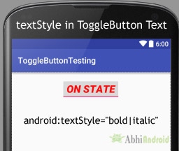
7. textStyle: textStyle attribute is used to set the text style of the text of a Toggle button. You can set bold, italic and normal. If you need to use two or more styles for a text view then “|” operator is used for that.
Below we set the bold and italic text styles for text of a toggle button.
<ToggleButton
    android:id="@+id/simpleToggleButton"
    android:layout_width="wrap_content"
    android:layout_height="wrap_content"
    android:checked="true"
    android:textOff="Off State"
    android:textOn="On State"
    android:textSize="25sp"
    android:layout_centerHorizontal="true"
    android:textColor="#f00"
    android:textStyle="bold|italic"/> <!-- bold and italic text style for displayed text-->
Below we set the black color for the background and red color for the displayed text of a ToggleButton.
<ToggleButton
    android:id="@+id/simpleToggleButton"
    android:layout_width="wrap_content"
    android:layout_height="wrap_content"
    android:checked="true"
    android:textOff="Off State"
    android:textOn="On State"
    android:textSize="25sp"
    android:layout_centerHorizontal="true"
    android:textStyle="bold|italic"
    android:textColor="#f00"
    android:background="#000"/><!--Black Color Background-->

/*Add in Oncreate() funtion after setContentView()*/
ToggleButton simpleToggleButton = (ToggleButton) findViewById(R.id.simpleToggleButton);
simpleToggleButton.setBackgroundColor(Color.BLACK);
9. padding: padding attribute is used to set the padding from left, right, top or bottom.
- paddingRight :set the padding from the right side of the toggle button.
- paddingLeft :set the padding from the left side of the toggle button.
- paddingTop :set the padding from the top side of the toggle button.
- paddingBottom :set the padding from the bottom side of the toggle button.
- Padding :set the padding from the all side’s of the toggle button.
Below we set the 40dp padding from all the side’s of the toggle button.
<ToggleButton
    android:id="@+id/simpleToggleButton"
    android:layout_width="wrap_content"
    android:layout_height="wrap_content"
    android:checked="true"
    android:textOff="Off State"
    android:textOn="On State"
    android:textSize="25sp"
    android:layout_centerHorizontal="true"
    android:textColor="#f00"
    android:padding="40dp"/> <!--40dp padding from all the side's of toggle button-->

Below we set the icon to the Top of the text of a ToggleButton. In the similar way you can try for other three attribute yourself.
<!--Make sure to add ic_launcher image in drawable folder-->
<ToggleButton
    android:id="@+id/simpleToggleButton"
    android:layout_width="wrap_content"
    android:layout_height="wrap_content"
    android:checked="true"
    android:textOff="Off State"
    android:textOn="On State"
    android:layout_centerHorizontal="true"
    android:textColor="#000"
    android:drawableTop="@drawable/ic_launcher" /><!--drawable icon at the bottom of text of top buttton-->

ToggleButton Example In Android Studio:
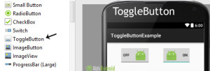
Below is the example of ToggleButton in Android Studio. In this example we display two toggle button with background and one “submit” button using attributes discussed earlier in this post. Whenever user click on the submit button, the current state of both toggle button’s is displayed in a Toast. Below is the final output, download code and step by step explanation:

In this step we create a new project for ToggleButton in Android Studio by filling all the necessary details of the app like app name, package name, api versions etc.
Select File -> New -> New Project -> Fill the forms and click "Finish" button.
Step 2: Open res -> layout -> activity_main.xml (or) main.xml and add following code:
In this step we open an xml file and add the code for displaying two toggle button and one normal Button.
<LinearLayout xmlns:android="http://schemas.android.com/apk/res/android"
    xmlns:tools="http://schemas.android.com/tools"
    android:layout_width="match_parent"
    android:layout_height="match_parent"
    android:orientation="vertical"
    android:paddingBottom="@dimen/activity_vertical_margin"
    android:paddingLeft="@dimen/activity_horizontal_margin"
    android:paddingRight="@dimen/activity_horizontal_margin"
    android:paddingTop="@dimen/activity_vertical_margin"
    tools:context=".MainActivity">

    <LinearLayout
        android:layout_width="wrap_content"
        android:layout_height="wrap_content"
        android:layout_gravity="center_horizontal"
        android:orientation="horizontal">

        <ToggleButton
            android:id="@+id/simpleToggleButton1"
            android:layout_width="wrap_content"
            android:layout_height="wrap_content"
            android:layout_gravity="center_horizontal"
            android:checked="false"
            android:drawablePadding="20dp"
            android:drawableRight="@drawable/ic_launcher"
            android:textColor="#000" />

        <ToggleButton
            android:id="@+id/simpleToggleButton2"
            android:layout_width="wrap_content"
            android:layout_height="wrap_content"
            android:layout_gravity="center_horizontal"
            android:layout_marginLeft="50dp"
            android:checked="true"
            android:drawableLeft="@drawable/ic_launcher"
            android:drawablePadding="20dp"
            android:textColor="#000" />
    </LinearLayout>

    <Button
        android:id="@+id/submitButton"
        android:layout_width="wrap_content"
        android:layout_height="wrap_content"
        android:layout_gravity="center"
        android:layout_marginTop="50dp"
        android:background="#0f0"
        android:padding="10dp"
        android:text="Submit"
        android:textColor="#fff"
        android:textSize="20sp"
        android:textStyle="bold" />
</LinearLayout>
Step 3: Open app -> java -> package -> MainActivity.java
In this step we open MainActivity where we add the code to initiate the Toggle Buttons and normal Button. After initiating we perform click event on button and display the text of current state of ToggleButton using a Toast.
package example.abhiandriod.togglebuttonexample;

import android.support.v7.app.AppCompatActivity;
import android.os.Bundle;
import android.view.Menu;
import android.view.MenuItem;
import android.view.View;
import android.widget.Button;
import android.widget.Toast;
import android.widget.ToggleButton;

public class MainActivity extends AppCompatActivity {

    ToggleButton simpleToggleButton1, simpleToggleButton2;
    Button submit;

    @Override
    protected void onCreate(Bundle savedInstanceState) {
        super.onCreate(savedInstanceState);
        setContentView(R.layout.activity_main);
        // initiate toggle button's
        simpleToggleButton1 = (ToggleButton) findViewById(R.id.simpleToggleButton1);
        simpleToggleButton2 = (ToggleButton) findViewById(R.id.simpleToggleButton2);
        submit = (Button) findViewById(R.id.submitButton);
        submit.setOnClickListener(new View.OnClickListener() {
            @Override
            public void onClick(View view) {
                String status = "ToggleButton1 : " + simpleToggleButton1.getText() + "\n" + "ToggleButton2 : " + simpleToggleButton2.getText();
                Toast.makeText(getApplicationContext(), status, Toast.LENGTH_SHORT).show(); // display the current state of toggle button's
            }
        });
    }


}
Output:
Now start the AVD in Emulator and run the App. You will see two ToggleButton and submit Button. Click on the submit button which will display the state of ToggleButton.
3 thoughts on “ToggleButton (On/Off) Tutorial With Example In Android”
Leave a Reply to Keshav Cancel reply
Premium Project Source Code:
- Food Ordering Android App Project Source Code
- Ecommerce Store Android App Project Source Code
- Convert Website Into Android App Project Source Code
- Quiz Game Android App Project Source Code
- Radio Streaming Android App Source Code
- City Guide Android App Project Source Code
- QR Barcode Android App Project Source Code
Hi Sir, my question is the same as @Keshav
hello sir, i want to load listview with toggle button for student attendance.i want to store present and apsent student status in arraylist with his id.how can i do this…plz help me sir…thank u…
How do I change the on-off indicator color.